10 January, 2012

The last post (a rather abrupt end I would suppose)

So yes, this is going to be the last post for this blog (unfortunately). So refresher's course time!!!!!

The Antarctic is more than 10 times the size of the Arctic Ocean (ice volume).

Both are affected by the recent global warming. There are localised variations in the rates of decrease of ice cover in both poles. Take for example the Antarctic Peninsula, where in some areas glaciers have retreated while there are some that have actually advanced in the same period of time. 

Changes in ice cover are not just directly affected by temperature changes, though temperature changes is one of the main drivers of changes in ice extent. Ocean currents, upwelling of warm water, stationary warm water along coasts have also affected changes in ice cover. And also solar forcings have come into play here. Which shouldn't actually be a huge surprise, since sunspots and solar flares have been scientifically proven to affect our climate, albeit on a rather short-term scale. 

We've seen the Antarctica from the beginning of the Holocene (12,000 years ago) and the Arctic Ocean (1,450 years ago) and we've seen even more evidence that even in a cool climate (Little Ice Age), other influencing factors have made ice extent in certain areas decrease. 

We've also talked about Greenland (though we focussed more on one glacier, which can be used to represent quite a number of glaciers in the region). Greenland's important to our study of the poles since it holds a significant volume of landlocked ice and contributes greatly to the threat of sea level rising. 

There's one mislabelled entry 'IPCC's forecast about the Arctic Sea ice melting completely by 2020'. It's actually Dan Miller's interpretation of it) Check out Jonny's blog post that's related to that video. http://66degreeslatitude.blogspot.com/2012/01/i-think-i-need-to-be-more-careful-with.html#comment-form. It's basically about sensationalism in the context of global warming and falsifying facts for personal motives. 

And then we had the Durban Climate change talks and Frozen Planet by BBC, which tied in nicely with the aim of my blog and also the current popular debate AGW. Do continue reading the progress on the Durban Climate change deal. It'll be quite a significant progress if it truly succeeds. 

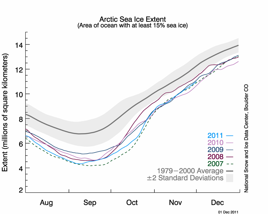
And then there's the whole issue of multiyear ice and first year ice, where exposure of multi year ice reflects much about the recovery rates of the glaciers and ice sheets. 

Not to forget, we talked about polar bears and other Arctic animals (like in the previous post) being directly affected by the ice and whether or not we should even try to save them. 'Their future looks bleak no matter what we do, so why waste more money' stand: Adopt or not to adopt this stand? 

I was going to squeeze in one more post about how the changes in the Arctic Ocean is influenced by atmosphere, sea ice, and ocean and recently, anthropogenic activities from this rather long and technical paper by John E. Walsh titled 'Climate of the Arctic Marine Environment' (2008). Since it basically just reiterates the posts I put up from NSIDC and NASA etc, it isn't that big a loss. But since we've mostly been talking about history, let's take a tiny peek into the predicted future of the Arctic Ocean through this diagram (which is basically self-explanatory) from John Walsh. 


Look how small the ice cover is getting from 1980 to the future in 2090!

I hope you gained at least a little bit of knowledge from this blog about the poles. My apologies for not fully covering everything about the poles. If I've somehow managed to spark off your interest in learning about the poles and the environment, NASA and NSIDC websites are a good place to start. They explain diagrams and do not have as much jargon as any scientific article found in a journal, so it's easier to understand. 

So with the little bit of knowledge and facts about the poles and what they signify, please put that knowledge to good use. Critically analyse the articles in the news about global warming as well. Not everything out there is the truth.

I'll leave you with this short video about how scientists take cores from the Antarctic for analysis. Just for general knowledge!


Have a great year ahead! Don't miss me too much :)


Wrapping up the blog: a video you TOTALLY MUST WATCH


This is a video of a Google Tech Talk in 2009. It's called 'Dramatic Changes in Polar Ice: Are we waking sleeping giants?' It's about (what else) changes in the ice extent in the Polar regions and what's the projected estimates of that extent in the next 10 to 100 years and what will be the consequences.

The reason why I think this video must be watched by all is that it's a great lecture for everyone about the mechanisms of the changes in the ice extent in the Polar regions. It's simple to understand and yet it covers the basic knowledge about the polar regions and more. He teaches how ice sheet works in the global context and how to read the diagrams and the graphs that he shows. It's an hour long but I can't emphasis just how great this video is for anyone to understand the Poles. 

It's simple, concise and straightforward. None of the political crap that we hear interspersed in a many such scientific debates/conferences. Do, DO, DO, watch this. It does a much better job than I did in explaining ice mechanisms and the instruments used to measure ice extent. 

08 January, 2012

Arctic Ocean: fast forwarding the last 1,450 years

To date, the Arctic sea ice extent is more than 2 million sq km smaller than in the late 20th century. It's been observed that the late-summer ice cover, mainly composed of thick multi-year ice, has been shrinking at about 8.6% per decade, which is unprecedented in the last 1,450 years. 

Just to refresh your memory, loss of sea ice in the Arctic Ocean will have disastrous consequences on climate, ocean circulation (which will be expounded in this post), ecology (remember the polar bears) and economics of the Arctic (shipping lines, eskimos etc etc). Sea ice cover responses to temperature changes and is influenced by the atmosphere and the ocean. This study by Kinnard et al. confirms (as expected) that the recent decrease in summer Arctic sea ice is 'consistent with anthropogenically forced warming' (Kinnard et at., 2011) through charting Arctic sea ice changes in the last 1,450 years. 

Methodology
They took raw data from areas around the Arctic basin (circum-Arctic) (Fig. 1). In total, there were 69 proxies used.They were obtained from ice cores, tree-ring chronologies, lake sediments. Two historical series of sea ice observations were used to get an anthropogenic view . 


Ice core proxies were mainly stable isotope ratio of oxygen. It's an air temperature indicator amongst other uses. Data of sea ice openness and sea surface windiness was also obtained through measurements of sea salt ions concentrations amongst others. (Read the paper for more descriptions about the proxies and their uses)

Results

Coverage of the central Arctic is poor because they were unable to get any samples from there. Sea ice variability is the greatest in the marginal ice zone as expected. They found that the proxy-based reconstructed history of the late summer Arctic sea ice extent from AD 561 to 1995 showed that pronounced decline in summer Arctic sea ice cover that began in the late 20th century is 'unprecedented in both magnitude and duration when compared with the range of variability (of sea ice extent) of the previous 1,450 years'. The low ice extent observed since the mid-1990s is well below the range of natural variability when we study the reconstruction. 

The reconstructed history of the summer ice in the Arctic sea was also paralled in the Barents sea: low values at AD 1600 and an increase afterwards and a minimum in the late 20th century. (Figure 3)


While the Barents Sea and Chukchi Sea and Fram Strait show similarity in changes in ice extent with the Arctic Circle, North Iceland diverges slightly with a significantly lesser extent of sea ice before AD 1200 and an overall increase afterwards (Fig. 3e). The reason for sea ice along its coast during winter and spring is partly because of sea drifting out of the Arctic rather than it being formed there. 

Surprisingly, there seems to be a poor correlation between NAO index and the Arctic sea ice cover in the reconstructed history. Only in the 20th century, did the positive NAO index correspond with the pronounced warming in the 20th century. This result only confirms that while the NAO plays an important part influencing ice extent in the Arctic, it is a combination of it with other factors that ultimately causes the changes in ice extent. However, the reconstructed NAO indices are still severely limited in showing us the changes of meridional atmospheric circulation which could confirm the theory of the lesser extent of sea ice during the Little Ice Age compared to the Medieval Warm Optimum was caused solely due to enhanced southerly advection of warm air into the Arctic.

Figure 3h suggests that there was an increase in invasion of warm and saline water from the North Atlantic into the Arctic Ocean causing a decrease in sea ice cover in the Arctic Ocean.  

Conclusion

So basically, what this article is saying is that the Arctic sea ice cover during the pre-industrial period was probably influenced by the intrusion of warm Atlantic water into the Arctic Ocean. The reason for this periodic intrusion is probably just part of the ocean-atmosphere-sea ice dynamics. From figure 3, the clear decrease of Arctic ice extent in recent decades can be linked to increasing warming of the Arctic that hasn't been observed in the last 1,450 years. For now, the most possible reason for that is because the warming it's experiencing recently is anthropogenically forced. 

This study is quite well-rounded in terms of the data that they obtained to reconstruct the Arctic's history. They were able to study cores taken from areas around the Arctic basin that had significant co-relation to the Arctic itself so parallels could be made between them. 

However, we still need to know what's going on in central Arctic. We need to know if the center of the Arctic (which this study was unable to obtain data from) is unstable and vulnerable to melting because that would mean that the multi-year ice may be gone and the Arctic Ocean might be ice free in the summer sooner than expected. 

Reference:
Kinnard, C. et al (2011) 'Reconstructed changes in Arctic sea ice over the past 1,450 years', Nature, 479. 


More graphs of the Arctic and Antarctic ice extent

Well, this blog is heading towards it's final few posts. Hopefully, I'll be able to make the most of the next few days to conclude this blog well. 

Anyway, in quite a few posts back, I mentioned old ice and new ice and the significance of their proportions relative to each other. I found this good online article on (where else) the NSIDC comparing the age of sea ice in the Arctic in the year 1985 and 2011 in March. The image below shows the Arctic basin. The one on the left is in the year 1985 and the right, 2011. The deeper the blue is the older the ice (the thicker the ice is, the older the ice is likely to be right at the bottom, remember?) 

A study by Maslanik et al. was found that in 1987, 57% of the ice was at least 5 years old and a quarter of that was at least 9 years old. In 2007, only 7 of it was at least 5 years old and none of it was 9 years old! That's a huge decrease in just 20 years!


Old v. new ice in Arctic, March 1985 and 2011


So far, in all the posts I've been talking about ice thickness but I never really found a graph to show the changes (other than videos that don't really quantify the thinning of the ice). Here, below, I found a rather simple one where ice thickness has been plotted out. It is probably the average of ice thickness throughout the entire Arctic Basin. The multi year ice is basically ice that's present for a few years and first-year ice is newly formed ice in the recorded year. There is a slight increase from 2006 to 2007 in both types of ice probably because of newly fallen snow cover. Overall, however, there is a decrease in thickness of both types of ice. If you look at the heat graph, you'll find that there's a lot more areas covered in pink in Feb-Mar '08 than in '06.
ICESat thickness estimates

The reasons for this have been discussed in previous posts but I want to bring up a point that I haven't managed to discuss properly yet. It's generally accepted that the general cause of the decline in extent and thickness of sea ice is due to the warming. However, temperature works together with the North Arctic Oscillation (NAO). That's a pressure system and changes periodically with the shifts in the position of the mid-latitude jet stream. When the jet stream moves up north, sea ice decline increases in rate (Positive phase) and the reverse is true. So even if the climate isn't warming, the movement of the jet stream is natural and depending on whether it's positive a negative phase, extent of sea ice will be affected in the Arctic Basin. And that strong positive signal in the mid 1990s may have been part of the reason why the older ice was exposed and melted, though it's certainly not the main factor. 

What needs to be focussed on is that in the early 2000s, the Beaufort Gyre (which is a pressure system in the Arctic, think of a water whirl pool but in the air and affects the ocean and ice circulation pattern in the Beaufort sea). It forms a sort of protection for ice that is within the Gyre's circulation, allowing it to remain for years without melting. However, this ice is melting in the southern end of the Gyre due to warming temperatures and more extensive melting in the summer. 

The more pressing matter is that the melting rate is increasing but the recovery rate is slowing down. In the previous post we see that the Arctic sea ice has almost halved in extent and we're not seeing nor expecting any sort of recovery. 

I'm trying to find some sort of positive tone to end of this post (unlike the other 10 posts). So here's a graph that's somewhat optimistic (though misleading). The red line shows that the Antarctic sea ice extent is increasing from 1978 to 2011 (just slightly). Through the opposite can be seen in the Arctic according to the graph below. Looking at the red graph, we see that even if the ice extent is increasing, there seems to be huge variations from year to year, signalling that the ice extent isn't stable and that we shouldn't let down our guard on global warming. The Antarctic's ice needs to be watched carefully since most of the ice is locked on land. If the ice shelves collapse, the glaciers behind it will follow and soon, the ice on the Antarctic might be all lost. That is, if the climate warms even further. 

Arctic and Antarctic Sea Ice Extent, 1979-2009

So much for a positive ending. But well, we shouldn't be depressed. At least we're starting to do something.

07 January, 2012

IPCC's forecast about the Arctic Sea melting entirely by 2020


Two posts ago, Scientists Jennifer Kay mentioned that it's currently too difficult to pinpoint when all the ice in the Arctic Sea will be completely melted thought they know that it will be if we don't do anything to save it. In this video, Dan Miller shows us a graph from the IPCC and a video animation of the changes happening in the Arctic Sea. They predict that the sea ice will be completely gone by 2020 and that the extent of the Arctic sea ice has halved already.

He mentions feedback, which is basically a concept where even after an event as occurred, the consequences of it carries on, making the effects stronger. In this case, when ice melts, the natural albedo is gone and with the dark water of the sea exposed, more heat is retained making the poles warmer as well.

But his claims about ice disappearing entirely by 2020 isn't backed up by any real scientific proof. He merely extrapolated the thick, black line. But it does seem quite convincing doesn't? With so much scientific uncertainty about the dynamics of the ocean-atmosphere-sea ice, continuing the linear line down to 2020 seems as possible as 2100. Unfortunately for Dan Miller, his method of proving that the ice will be completely gone by 2020 seems dubious especially since he's a businessman with stakes in green technology.

Just another video

Here's another NASA video showing the changes in ice extent in the Antarctic. It starts from May 26 2009 to July 31st 2010. It starts with an over view of Antarctica then zooms to the Antarctic Peninsula, going over the entire continent before zooming out again.

Again, we can see the changing thickness of the sea ice other than the boundaries consistently changing. Note that the Antarctic has 10 times more locked up water in volume than the Arctic Ocean. Think about what it'll be if the entire continent melts (which isn't impossible).


05 January, 2012

Our fault or Mother Nature?

In this National Snow and Ice Data Center (NSIDC) article, 'Climate change or variability: what rules the Arctic sea ice?' the strongest point of the global warming naysayers is briefly examined.

Since satellite measurements started in 1979, the Arctic sea ice has declined by 30%. However, as shown in the video in a few posts earlier, extent of sea ice varies on a year to year basis. The biggest question for scientists is how much of this variation and decrease in sea ice can be attributed to human activities and to natural variability. This question is very important to the individual, the governments and also corporations since the answer to this question will have very far reaching and permanent effects. If we're truly in the Anthropocene, then the billions of dollars pumped into inventions, research, infrastructure etc will be justified. Climate change talks between countries, like the recent Durban conference, will truly have purpose. Buying hybrid cars, changing our lifestyle to become vegetarians, changing light bulbs to eco-friendly ones etc, will be more logical to us to prolong our survival. 

However, we must be aware that every dollar that goes into green research, green governmentality, green lifestyle, is a dollar taken away from increasing economic growth immediately. The economic benefits of a green world will come much much later. They will come, but can we afford to wait for it? In this current economic atmosphere, can we afford reckless spending if the answer to the above question is no?

Through modelling of climate change, scientists are studying the combination of impacts of factors like increased concentration of greenhouse gases in the atmosphere and the dynamic interaction of ocean, land and atmosphere and its effect on sea ice extent. According to scientists Jennifer Kay, 'Models let us replay the 20th century multiple times to quantify the relative contributions of climate variability and greenhouse gas increases to observed and modeled hemispheric sea ice trends'. But because of many gaps in our knowledge of the environment, these models have assumptions input in them in order to work.

So for now, we do not have a definite answer to 'how much are we to blame for climate change'. However, we do know that if we do not do something to stop further climate change, the poles will lose their ice cover.

Greenland glacier: Mittivakkat Gletscher

Going just slightly nearer to us, today's post will be about one of Greenland's glaciers: Mittivakkat Gletscher (MG). It's a well-observed and studied Greenland glacier on the South-east part of Greenland. Like most of the observed glaciers, this glacier is retreating as well. The most significant part of the study of this study is that it is indicative of glacier changes in the broader region. Most of the glaciers that we study like that in the Antarctic Peninsular cannot be used to represent the entire region due to local variability in climate and environment. Thus, the study of MG is especially important due to it's regional representation. In this paper (look at the end of the post for the title), they study the reasons for the retreat and also the surface mass balance of the glacier). 

First of all, summer temperatures in Greenlands's coastal areas have 'increased by an estimated 1.7 degree Celsius on average' (Camiso, 2006). More recently,surface melt extent and glacier area loss hit a record high in 2010 due to a relatively dry winter (less snow cover in winter = more exposure of glacier ice in summer) and an exceptionally warm summer. Of course, as in most cases, Greenland's warm temperature anomalies vary locally. The west of Greenland is experiencing a much higher melt rate as observed since 1990 than the rest of Greenland. Overall, the Greenland Ice Sheet is losing mass at more than 200 Gt per year for the pas several years (Allison et al., 2009). 

A. Cumulative net mass balance. Gray zone indicating 15% error and accumulation area ratio for MG from 1995 to 2010. B. Observed winter precipitation and mean summer air temperature from Tasiilaq and Nunatak. 


The surface mass balance of the glacier is measure by taking measurements of the trends in ice/snow extent and ice volume to calculate the equilibrium line altitude (ELA), which is a spatially average elevation of the equilibrium line where a set of points on the glacier surface is marked where the net mass balance is zero. In the figure above, A shows that for 13 years out of 15 years, the glacier mass balance has been negative. This is important in its measurement since the glacier mass loss is not just simply losing volume through melting or sublimation. Loss of mass leads to instability where the degree varies with the location of the loss of mass. B shows that with increasing temperatures, winter precipitation decreases as well. 

The coloured lines show the progression of the Mittivakkat Gletscher retreat in certain years from 1900 to 2010.
The above figure shows that the Mittivakkat Gletscher has been in retreat since 1900 (maximum glacier extension during the Little Ice Age). In all, it has retreated by about 1600m since 1900 and 1300m since 1931. Recent average retreat rates are about 6m per year. From 2009 to 2010, it lost about 2% (2.16m average surface mass loss) of the total glacier volume, significantly above the range of the 15-year average loss of about 0.87m. 

This graph shows the correlation of the Tasiilaq MAAT anomaly and the other stations' anomalies. Most of the correlations are above 0.5 suggesting that we can safely use observations for once glacier to represent all the others.
As mentioned above, studies have found that the mean annual air temperature (MAAT) anomalies found at MG are significantly corelated to that at Tasiilaq (r2 = 0.61 - 0.91) and at the Summit (r2 = 0.42) (The figure above shows the high correlation of the stations in Southeast Greenland with each other) This makes the study of the MG even more important and also conclusive since it also proves that higher temperatures are causing the instability of the ice sheet (the glacier will likely lose at least 70% of its current area and 80% of its volume even without further climate changes (Mernild et al., 2011)). 

In conclusion, the general trend for MG since 1995 is that summer temperatures are higher and winter precipitation has been decreasing (recovery rate of glacier mass is slower) leading to a more negative glacier mass balance as melting increases. These factors have led to the retreat of MG. With high correlations of the MG with other local glaciers, this observation is representative of the region. Thus we should also expect to see the same thing throughout Greenland. This bodes ill for the world since this study shows that even without further climate change, we are unable to stop the melting of Greenland's glaciers. 

What then shall we do? It seems hopeless to prevent glaciers from melting so should we go on business as usual? Or pump in even more money to try to save the world from warming (if it is even possible)? The Durban climate change talks shows us that the world leaders are trying to do the latter. If so, the promises of the governments to lower carbon emissions and help climate change vulnerable countries must be kept. But if it is at the expense of the country's economic growth, what then should governments do? 

References:
Mernild, S.H. et al. (2011) 'Increasing mass loss from Greenland's Mittivakkat Gletscher', The Cryosphere, 5, 341-348.

Comiso, J. (2006) 'Arctic warming signals from satellite observations', Weather, 61, 70-76. 

03 January, 2012

Follow up on Durban climate talks 2011

All seemed well when the developed and developing countries agreed to legally commit themselves to cutting greenhouse gases emissions and a climate change fund will be set up to help developing countries vulnerable to the disastrous effects of climate change. However, according to Dipu Moni a Blangadeshi minister, the developed world is failing to keep it's climate change pledge

To date, less than a tenth of the pledged $30bn promised by the end of 2012, has been made available. And this is after 3 years of delay in delivering the promised money. The way governments have acted when it comes to taking action on reducing climate change has been so far shameful and selfish and childish, except for Durban 2011. Developed countries need to step up to their responsibilities and stop worrying about whether their already stained reputation will become blacker.

It seems promising that the developing countries have realised that while they can take advice from others, each country is unique and their paths to becoming more influential and more powerful on the global stage must be forged for by themselves. No longer will, or can, they hide or be suppressed by more powerful countries if they wish to save their own countries as it's evident that ultimately, each government will look to use whatever they can that will benefit themselves and their countries, financially and politically. They need to gather their influence and political power, not bickering amongst themselves like the developed world, in order to be heard and listened to

This article marks a change in attitude in the developing world. It will be exciting to see what will happen next. Hopefully, the developing countries will be enabled to gain their own share of power and influence and they will not buckle under the pressure from countries like China.


02 January, 2012

Arctic Ocean: seasonal changes part 2

Hello again! This is the first post of the year!!! Hope you guys had a great start to the new year! It still feels strange to me that it's 2012 now.

Anyway, back to the topic! In the previous post, I was talking about the Arctic Ocean thinning, why it's important to observe that etc etc. And I also mentioned that while talking about the condition of the Arctic Ocean through the seasons, the climate and the ocean dynamics must also be observed since they're directly related to each other. On the 22/09/11 and 4/10/11, two articles from NASA shows and explains that the Arctic Ocean sea ice has declined to the point that it hit the 2nd lowest point in record. The lowest extent of ice in the Arctic Ocean occurred in 2007. In the September article, it is also mentioned that depending on the method of calculation, 2011 could have also exceeded the 2007 record for the lowest sea ice extent. Using the more optimistic calculation NASA and the National Snow and Ice Data Center (NSIDC), the 2011 Arctic Sea Ice Minimum was 2.38 kilometres below the average minimum extent measured between 1979 and 2000.

Compares the Arctic Sea ice extent from the months of August to December from 2007 to 2011.  It's obvious that 2007 is the dashed green line and 2011 is the light blue.  (Click to go to article)

It being the 2nd lowest sea ice extent minimum is even more worrying due to the different weather conditions in 2007 and 2011. In 2007, 'atmospheric and oceanic conditions were conducive for melting'. The skies were clear and wind patterns and warm air temperature thinned and melted sea ice. However in 2011, signs that the ice was already thinning before the melting period started in the summer of 2011 were shown in the thin and spread out ice. What is even more worrying is that the weather conditions in 2011 was typical (not conducive for melting) and yet, level neared that of 2007! 

2011 sea ice minimum

The image above appeared in the October article. It shows the extent of the sea ice in the summer of 2011. The yellow line is the 30 year average of ice extent minimum (started since satellite data collection in 1979). It's evident that the ice extent last year was much smaller! The red line is what's causing a huge wave in the shipping industry. For centuries, shipping routes had to go through the Pacific, Indian and Atlantic Ocean to get from one end of the world to the other. It took up a lot of time and money. With the Northwest Passage (red line) opening up, it could void the current shipping lines, and ports, since the usually ice obstructed path is now melting, opening up a shorter and more efficient shipping path. 

There is one thing that I did neglect to mention. Remember a few posts back, there was a video about the ice cores and how far back they can date in history? The oldest ice layers are the ones right at the bottom of the sea ice and they usually occur in the thickest parts of them. These bottom layers can be considered permanent covers since they've been present for tens of thousands of years. The seasonal ice are those formed during winter but gone in summer. What's really scary is that since 1979, sea ice has been declining by 12% per decade and this includes the permanent ice layers, resulting in the ice thinning. 


There is a video in this article that explains sea ice and the implications and possible origins of this melting. In this article by NSIDC, the above image shows the temperature anomalies at about 3000 feet. While over the Arctic Basin, temperatures are near normal and slightly below average, other areas show that temperatures and higher. The reason for this is that because of low ice extent in the summer, much of the ocean is exposed  absorbing more heat (as explained in the video) which is then released over winter. There is still much in this article that I haven't written about but they're fairly self-explanatory. Do take time to read through it. It's simple and brings out the main points of each diagram without lengthy explanations. 

I don't want to drag this post out any longer. I'll just leave you with this statement by Joey Comiso, scientist at NASA Goddard Space Flight Centre in Greenbelt. ' The sea ice is not only declining, the pace of the decline is becoming more drastic'. Meaning that rates of ice decline from climate models are far exceeded.