31 December, 2011

Changes of the Arctic Ocean from summer to winter

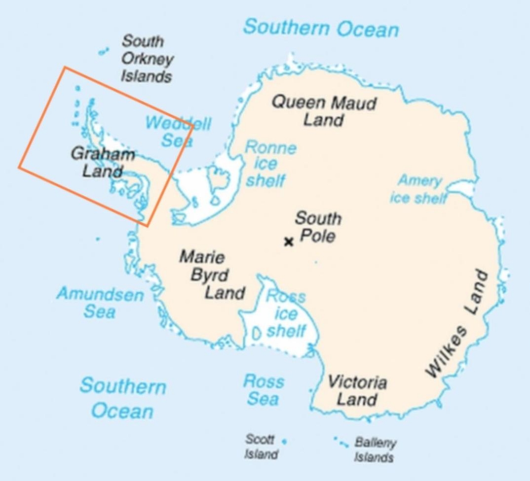
So continuing from the last post, what did you think about the video? For me, I was trying to see the start and ends of each seasons. Summer of 2010 was pretty obvious, the extent of ice had retreated so much that most of the Arctic Circle was free of ice. And in the last few seconds of the video, we went back to winter where it seems to me that the ice had regained most, if not all, of the extent in '09. Now, just as a reminder, the Arctic Ocean, unlike the Antarctica, is composed mainly of sea ice.

Just by looking at this video, I would actually feel reassured since the ice extent seems to be recovering pretty well compared to '09. But of course, using a comparison that's only a year apart, when the Earth's history is about 4.5 billion years doesn't make sense. So for me, in this respect, the video fails to show any sort of significance (but is still very cool to watch).

Did you also notice that as the seasons passed, there were patches in the sea ice that seemed to be slightly bluer than the surrounding? Not because it's free of ice but rather the ice is thinner at those places. Like the Antarctic, the thickness of the sea ice is important as an indicator of ocean temperature. The Arctic Ocean plays the same role as the Antarctic for the Northern Hemisphere. It's a thermometer of climate change. However, the Arctic Ocean may be slightly more vulnerable than the Antarctic since its extent is directly dependent on the ocean temperature. Huge bodies of water have higher heat capacities and stay warmer for longer and this has implications on the sea ice thickness, extent and rate of recovery as it progresses from summer to winter. But this  discussion of the interaction of the sea ice and the ocean dynamics shall have to be saved for another time. 

I was exploring the NASA image gallery of the Arctic Ocean when I came across this article titled 'Ponds on the Ocean'. In the previous paragraph, I mentioned that there were patches of 'discolourations' on the Arctic Ocean where in some parts, the ice was thinner than the surroundings. This article explains them very well. These ponds are formed during the spring and summer melt. So if you remember primary school science well, when ice forms, it leaves behind most of its salts. When parts of the surfaces of the ice melts, they then form freshwater ponds on top of the salty ocean water. That is very cool. You won't find that anywhere else in the world!

Then, what is the point of me telling you all these things? Yes, the ice is thinning but aren't we doing things now to prevent more destructive climate changes from occurring to the best of our abilities (or so we believe)? 

I think we should remember that on the Arctic Ocean, there's a huge ecosystem that's highly vulnerable to these changes. Ice thinning means that cracks occur more frequently, quicker and larger than before. And they occur most during spring and summer when temperatures are above melting point. And animals come out to hunt then in preparation for the winter. And unlike humans, they do not have the benefit of technology to overcome these adversities that are hitting them fast and hard. Polar bear populations are dropping and the increasing difficulty in hunting isn't making their lives any easier. Arctic wolves, birds, Eskimos or Inuits (whichever you feel is more politically correct) are having to adapt their way of lives and hunting behaviour to these changes in the ice in the Arctic Circle. 


The question then we have to think about is whether or not they can adapt to these changes fast enough. The popular example of the polar bears shows that they can't. Should we then abandon trying to save them? We're living in the Holocene (or the Anthropocene), the climate will only get warmer since we're in the inter-glacial period. Living things that cannot adapt to the warming will only then become extinct as is the workings of Nature. Let's have a good think about this. 

22 December, 2011

Arctic Sea!!!! (Where cute and cuddly polar bears live :D)

Well, it is the holidays now. And so, because I'm super lazy, to ease you guys into the topic of the North Pole, here's a video for you to watch! It basically shows us how the ice extent has changed from September 4th of '09 to January 30th in the Arctic Circle. The problem with this video is that it doesn't tell us the starts and ends of the winters and summers. But despite its ambiguity, we can still examine this video and hopefully, a few questions will come to mind while you guys watch it. 


While watching this video, take note of the ice around Greenland and the islands of Canada. Also, note that while the ice in the Arctic Circle seems to retreat quite a bit at some point, the extent of ice also seems to be regained by January 30th (the end of the video). So what purpose(s) does this video has? Or is it absolutely rubbish and useless?

This video is from NASA. Read the youtube video description. Please do comment and tell me what you think! :)

20 December, 2011

Durban Climate talks and Frozen Planet

The Durban Climate talks and BBC's amazing documentary Frozen Planet ended about 2 weeks ago. Whether or not it was a coincidence or a well-timed meeting of the two, both events highlight the current popular discourse i.e. global warming. 

In the early hours on a Sunday the 11th of December 2011, a breakthrough was declared after the Durban climate conference went into extra time after stalemates threaten another failure and a global climate change treaty was proclaimed to be on the horizon. The talks mediated by Connie Hedegaard, the EU climate chief, who is also 'the architect of the EU plan' managed to bring

'developed and developing economies together for the first time in a legally binding agreement to cut greenhouse gas emissions'. This deal is deemed a success for it also meets the aims of the EU, most developing countries and USA was 'brought on board'. For me, one of the more outstanding points of this deal is that the distinction between developing and developed countries has been largely eradicated, thus the both are subjected to the same legal commitments to curbing emissions.

While this does mark a huge progress (look at Copenhagen '09 when China stormed out of talks = epic failure) in that countries are taking a step away from shirking their responsibilities, the deal itself is not stringent enough and all in all, seems like a token gesture from governments to scientists and environmental groups. While UK's climate secretary Chris Huhne called this deal a 'significant step forward', environmental groups and scientists called it an 'empty shell of a plan' and 'failed to show ambition necessary to cut emissions... to avoid dangerous climate change'. If you want to read more of the reactions to the climate deal, the Guardian's article on 'Durban climate deal: the verdict' sums it up quite nicely. 


And then in that same week, on a the 7th of December, Frozen Planet aired its last (controversial to some) episode called 'On Thin Ice'. I didn't watch episodes 3 to 6 mainly because Frozen Planet did seem to have most of its focus on cute cuddly animals. But I did catch the last episode because it focusses on the effect of global warming at the poles and what could and is already happening to the ecosystems. It can already be observed the changes in the walruses' behaviours and migrations of penguins and other mammals who prefer warmer or colder waters into and deeper into the Antarctic. One video shot caught my eye. It was a spectacular view of the disintegration of one of a major ice shelf. Huge chunks of the shelf came apart, looking like jigsaw puzzle pieces. They were thick and long and wide enough for the helicopter David Attenborough was in to land on them safely!

After this episode was aired on BBC and also in America, global warming naysayers immediately had something to say about them. According to Christopher Booker, 'On Thin Ice' was full of bias-ness. Nigel Lawson called it 'patronising' on the Radio Times. Strangely enough, Booker and Lawson's wording in their pieces seems to me to be much more biased, where words such as 'preaching', 'climate change gospel' instantly puts a doubtful cast on this discourse. Lawson's every rebuttal to the points about global warming was refuted by Dr Mark Brandon. He clearly explains the importance of observing the ice thickness and not just its extent and puts right Lawson's claims of increasing polar bear populations and clearly states that global mean temperature is not polar mean temperature. 

Coming to a conclusion, Durban platform might have spelt significant progress on tackling climate change but more still needs to be done to prevent global mean temperatures from increasing beyond 4 degrees , much less hitting the 2 degrees temperature change target. The clear lack of ambition by countries to commit themselves to curbing emissions enough to prevent disastrous climate change is already showing at the poles. While the increase in polar mean temperatures is not reflective of the global mean temperature, it still shows us that the climate is warming much more rapidly than it would have naturally. If we see ice shelves on the Antarctic Peninsula breaking up now, what more can we expect in the future if climate talks remain stagnant or if progress is not fast enough? 

Do read David Attenborough's reflections after he visited the poles. He gives his firsthand insight after seeing for himself the changes undergoing there. It may provide better understanding for you about the effects of global warming.

19 December, 2011

Thawing of Arctic Ocean releases lots and lots of methane

Not that this is in some scientific journal, rather this article appeared on Digital Journal: Scientists worry about giant plumes of methane in Arctic Ocean

It tells of how the current warming climate is causing the seabed of the Arctic Ocean to thaw, thereby releasing all the trapped methane. In the shallow waters of the East Siberian Arctic Shelf, the methane is released into the atmosphere without oxidising into carbon dioxide.

Not all scientists agree that these methane plumes do exist, much less, are of any cause for worry. But this is still quite an interesting article to read. After all, ice traps air as well. If the glaciers melt, will not carbon dioxide and methane that was trapped in and under these ice also be released into the atmosphere?

07 December, 2011

Air bubbles!

A very brief summary of how we can see into the past through analysing Carbon Dioxide from trapped air bubbles in ice cores and how they do it. As snow falls and builds up as layers on the ground, air is trapped within these layers and is fossilised as the snow is compressed  by the weight of overlying layers of snow. 

By analysing the percentage of carbon dioxide in each layer, we're able to obtain information about the local temperature in the Antarctic and from there infer the global climate. The higher the percentage of carbon dioxide, the higher the temperature is. Thus, ice cores allow us to examine history and observe the relationship between temperature and carbon dioxide and transfer hypothesis on the present day.

28 November, 2011

Antarctica: from the beginning of the Holocene

In order to understand the changes and impacts of them on the Antarctic, we need to study its history. Since we're going through a warming period, it's important that we put in more effotrt in understanding past warming periods. First of all, in order to study the history of the Antarctic, we need to find out what happened in the past. Once again, we'll be focussing on the Antarctic Peninsula (AP) 

The Holocene (A super brief summary)

The Holocene began 12 000 years ago and is an inter-glacial stage after the last Ice Age. However, there have been observed climate shifts within the Holocene, each lasting thousands of years. The changes were marked by glacial advances and retreats. 

AP in the last 12000 years

Since the beginning of the Holocene, AP has been experiencing glacial retreats and advances. Cold events occurred inbetween warm events. For example, the George VI Ice Shelf collapsed 9.6 ka (thousand) years BP after 2000 years of relatively high early-Holocene SSTs (sea surface temperatures). It reformed and advanced again at 7.9 ka years BP as SSTs decreased. 

Early Holocene (11-9.5cal. ka)

The early Holocene was a period of warming in the AP. Warming of the AP occurred slightly before the beginning of the Holocene and carried on till it hit a climate optimum from 11 - 9.5 cal ka BP. The warming of the AP was reflected in the deglaciation of it. Most areas in the AP were under retreat by 14-13 cal. ka BP and this continued through the early Holocene. Records from the Palmer Deep record showed an increase in primary production and iceberg rafting at 11-10 cal. ka BP. 

Even during this period of time, regional differences in the effect that the warming had on the rates of ice retreat are evident. On the west side of AP, the lack of sequential retreat morianes on the continental shelf in Marguerite Bay suggests that the rate of ice retreat was quite rapid. However, ice sheet retreat was more gradual with periods of inactiveness on the east AP. 

Moreover, while many Antarctic records from ice cores, marine cores and geomorphological studies indicate that the early Holocene was a period of warming, the Palmer Deep record implies relatively cold conditions during the same period of time. the Palmer Deep record has an 'apparante cold proxy record' where there are lower diatom abundance and an assemblage characteristic of more sea ice amongst others. 

After the optimum (9.5 - 4.5 cal.ka BP)

This period after the optimum is a period of contrasting changes experienced in the AP. On the west side, the Palmer Deep record indicates that there was a southward intrusion of warmer, more subpolar waters from 9000-6700 cal. yr BP that led to the collapse of the George VI Ice Shelf that was reformed partially or completely by 7945cal yr BP. 

On the east side, the Larsen Ice Shelf-B remained intact throughout this period although the reason for that may be as simple as that it was too thick to be affected by the meltwater fracture mechanism. 

Thus this period of time for Antarctica was characterised by differential rates of deglaciation on the west and east sides of the AP. The west side had a higher rate of deglaciation and the ice retreated until at least 7-8 cal.ka BP. This was evidenced by the process of sedimentation (where sediments were carried to the bottom of lakes by melting glaciers) found in the lake basins there that were exposed then when the ice retreated. The east side however, did not become free of ice till much later in the Holocene. Some parts, like the Byers Peninsula, were ice covered till 5-3 cal. ka BP. 

Mid Holocene warm period (4.5 - 2.8 cal.ka BP) 

This was the next period considered to be when there was significant warming in the AP. Marine cores showed that this period of time was when there was reduced sea-ice coverage, greater primary production and an increase in meltwater-derived sedimentation. Lake sediments and multi proxy studies showed evidence of a warmer climate as well.

However, the Palmer Deep record (a marine record), showed that this warming wasn't out of the ordinary as suggested by other data. It indicated that the relatively warm current, the Upper Circumpolar Deep Water (UCDW) was present on the AP for a period of about 5000 years. More importantly, there was no obvious cooling between the onset of the early-Holocene warmth and this period. This relatively warm water disappears suddenly at 3600 cal. years BP compared to the gradual tailing off in lake records during this period of time. This shows that not only is there a regional difference of deglaciation rates, it strongly suggests that there are other factors affecting the extent of ice cover over the AP other than changes in SSTs.

Neoglacial interval (2.5-1.2 ka)

The end of the mid Holocene warm period was marked by a pronounced shift to colder climate conditions recorded in both the Vostok and Komsmolskaya ice cores after 2500 cal. yr BP. This is supported by findings that many biological proxy records in lakes and other sites show a positive correlation to a decline in temperature and a decline in primary production. It is still unsure whether there was glacier advances during this period of time due to poor dating.

Medieval Warm Period (1.2 - 0.6 cal.ka BP)

There may not have been a MWP in the Antarctic. Studies of various proxies and cores have not been able to allow for a conclusive statement. The only data that do show us clearly that there was a warm event occurring in the Ap at approximately the same time as the MWP are marine cores. 

And that was 12000 years of history of the Antarctic compressed into this under a thousand word blog entry. I'll be discussing the influencing factors in the extent of ice cover in the Antarctic next. The previous entry didn't do that good a job since I had limited it to only the last 50 years. the paper by J. Bentley et. al. 'Mechanisms of Holocene palaeoenvironmental change in the Antarctic Peninsula region)' (2009) does a great job explaining in detail the changes in the AP during the Holocene and the data used to understand the influencing factors of ice extent. A.E. Shevenell et. al. 'Holocene Southern Ocean surface temperature variability west of the Antarctic Peninsula' (2011) is a more detailed study of the WAP but read Bentley's one first. I found that that helped me understand the Antarctic better and allowed better understanding of Shevenell's paper.

17 November, 2011

Antarctic Peninsula: processes causing its warming climate


As the debate on climate change progresses, the focus on the poles has increased. The ice covered poles can be seen as a sort of thermometer for Earth since they respond almost immediately to changes in the climate. With technology as advanced as it is, videos showing geomorphological changes at the poles are a dime a dozen (I felt obligated to put in an amateur video because there are really cute penguins running from the waves here even though there are other videos showing part of the ice sheet collapsing clearer)


It is not unusual to see parts of the ice sheets break off, every summer the glaciers retreat and advance during winter. However, over the last 50 years, it has been observed that glaciers at both poles have been in retreat and despite re-growth during the winter months, there are an increasing number of glaciers that have not regained their original mass. While global warming does cause the loss of ice mass at the poles, the loss of ice mass at the poles is also contributed by ‘increasing precipitation, changing ocean temperatures’ (Cook et al, 2005). Most of the ice loss has been observed on the marginal parts of the ice sheet since they are the most susceptible to such environmental changes.

Below is map of Antarctica and the Antarctic Peninsula is indicated by the red box.


The Antarctic Peninsula is a Northwest extension of the main continent and observations have shown that it is showing much higher vulnerability to climate changes compared to the continent itself. Since the 1950s, the climate has warmed by 2 degrees (Cook et al, 2005). This regional warming of the Peninsula has led to a 10 fold increase in glacier flow and rapid ice sheet retreat (Rignort, 2006).  In the paper 'Retreating Glacier Fronts on the Antarctic Peninsula Over the Past Half-Century' by Cook et al in 2005, there are satellite images of the glacier retreat of Sheldon Glacier, Adelaide Island showing its retreat in 2001 compared to 1986. The break-up of the ice shelf is observed with the smaller ice extent and the broken, drifting ice shelf. From the earliest known position of ice shelves in 1953, 87% of glaciers in the Peninsula have shown overall retreat. The image below shows how much the Sheldon Glacier has retreated from 1947 to 2001. 

Glacier map (BBC from Bas data)
(BBC, 2005)

One of the reasons for the observed overall retreat of ice shelves is due to climate. The Antarctic Peninsula is warming at a rate of 3.4 degrees Celsius (give or take 1 degree Celsius) per century (Shevenell et al, 2011). This warming coincides with the positive rates of glacier retreat as shown by the figure below. 


However, in the figure above, while the general trend throughout the whole of the Antarctic Peninsula is a glacier retreat corresponding with a general increase in temperature there were advances in glaciers from 1945 to 1964. This suggests that there are other factors that influence the extent of the ice shelves in the Peninsula.

The reason for this discrepancy is due to the ocean-atmosphere heat exchange over the Antarctic Peninsula. It was found that from the 1950s, the Southern Hemisphere Westerlies that bring warmer air from the lower latitudes to the higher latitudes have experienced either a southerly migration (thus bring warmer air to higher latitudes) or has intensified (Shevenell et al, 2011). This then affects the Antarctic Circumpolar Current (ACC), which is an ocean current that circles the Antarctic, causing it to migrate southwards and/or intensify as well. This allows warm Circumpolar Deep Water to upwell along the Peninsula partly due to the ocean bathymetry and the ACC’s proximity and to mix with surface waters.

As a result, the advancement of glaciers prior to 1950 were due to the Westerlies being nearer to the Equator and not having that significant of an effect on the ACC, allowing for cooling of the climate. However, after that warming occurred due to the above described process and in combination with the anthropogenic global warming, this is resulted in the Antarctic Peninsula (and the rest of the Antarctic) to warm and thus experience a lesser extent of ice cover. 

In the next post, I'll go into the ocean-atmosphere heat exchange occurring over the Antarctic by taking you further back in time. Like the beginning of the Holocene 12000 years ago. 

Journals:

Cook, A.J., Fox, A.J., Vaughan, D.C., Ferrigno, J.G. (2005) 'Retreating Glacier Fronts on the Antarctic Peninsula over the Past Half-Century', Science, 308, 5721, 541-544.

Rignot, E. (2006) 'Changes in ice dynamics and mass balance of the Antarctic ice sheet', Philosophical Transactions: Mathematical, Physical and Engineering Sciences, 364, 1844, 1637-1655.


Shevenell, A.E., Ingalls, A.E., Domack, E.W and Kelly, C. (2011) ' Holocene Southern Ocean surface temperature variability west of the Antarctic Peninsula', Nature, 470, 250-255.

23 October, 2011

Why are maps so expensive? They're just drawings, really.

Last week’s post was an update on the latest in the cartography world that so happened to provide a good introduction to the general topic of my blog. I’m assuming that most of you reading my blog are like me; we don’t really know what’s so difficult in creating maps in this day and age when all cartographers have to do is to just follow the data provided. Basically, that was the notion I had in my head when I read about Times Atlas mishap. The hardest work they have is to make sure that the maps are scaled as best as possible, the general shape of each land mass is there and tiny little countries, like Singapore, are still dotted where they can be found on Earth. And of course, that the right colours are used to portray the different terrains, population densities and so on.

Then Anson recommended this article ‘Speculative Polar Cartography’ by Kevin Brown to me. It touches briefly on the mistake made by Times Atlas, but the condensed history of cartography it provides was what made me think harder about the skill and mentality involved in creating maps (and also gain an appreciation of the value of the National Geographic map of the world pasted on my wall). From the 16th century onwards, ‘modern mapmakers’ have used real facts and the scientific knowledge at the time, to map out areas of the world that may or may not have been substantially been physically explored. Speculative cartography is especially used in the mapping of the Polar Regions since these parts of the world are, even today, particularly treacherous to explore. From Gerard Mercator’s specific map of the North Poles called Septentrionalium Terrarum Descriptio in the 16th century, based on the Inventio Fortunata and pieced with geographical knowledge from various expeditions, to Phillipe Buache’s mapping of the Polar Regions in 1763, speculative cartography was used extensively to map these parts of the world.

According to the Free Online Dictionary, to speculate is to ‘assume to be true without conclusive evidence’. Based on the limited geographical facts these cartographers knew about the polar regions, they had to use something else to make up for the lack of data. (This part of the post makes me the happiest because I can totally shove this into the faces of people who say that geography is dead.) These mapmakers, and also the cartographers at Times Atlas, used their hypotheses of the world’s geography and geology (which includes studying ocean currents, magnetic poles, elevations and depressions on the surface land masses and ocean sea floors and more) to create the maps that we use today. And even now, we still rely on and study old maps for geographical knowledge. I may not have any papers at hand to back that up, but I’m pretty sure I’m right.

Brown concludes that Times Atlas’ mistakes on the map of Greenland was probably due to ‘either a misunderstanding of geography or an erroneous hypothesis’, which can and evidently do, lead to an misinterpretation of factual data. So while we may have advanced technology at hand that allows us to chart previously inaccessible areas, data that we present to cartographers are like any other data. They do not conclude to anything but what the person/people analysing them conclude. And Times Atlas’ mistake on the mapping of Greenland shows us the most important thing that many nay-sayers of global warming have to realise: while data presented to you are free to any sort of conclusion, a thorough understanding of the Earth’s geological and geographical theories and of the Earth’s physical and chemical processes and its interaction with the Sun is fundamental to gaining a less erroneous conclusion.

With that conclusion, I do encourage you to also read the chapter in Time’s Arrow, Time’s Cycle by Stephen Jay Gould about data collection and analysis (I have forgotten which chapter that is but the use of counting black and white swans is used as an example). It’s more of a philosophical book and it is very boring and dry in general (when I first read it). But it does explain (partly, I suppose) why I say that a thorough understanding of geological and geographical theories will lead to us forming a less erroneous conclusion, instead of a truer/accurate conclusion.

And I also promise that the next entry won't be discussing map methodology but the stability, or rather instability, of the ice sheets that make up Antarctica.

16 October, 2011

Even the 'experts' make mistakes

Hello hello and welcome to my wannabe academic blog. I'll try my best to shed some light and provide intelligent discussions on the changes of ice cover on the poles through time (and the significance of this) over the next 10 weeks. I will be dabbling into the cultural and ecological consequences of the changing volumes and surface areas of ice sheets at some point as well, so it's not all that science-y and oh my gosh the world is going to be like the movie 2012. 

Just so that I won’t scare people off with some stuffy and utterly dry journal, for the first entry (whoop whoop) I’m going to talk about something rather light-hearted. By that, I mean we can just have a good laugh, shake our heads and tsk away at someone else’s mistake, which is my favourite past time by the way. In this case, the head-shaking is done at the expense of HarperCollins for their very, very mis-leading 13th edition of the Times Comprehensive Atlas of the World, published some time in mid-September. The mistake isn’t that they forgot that Sudan is now split into two countries, though I can’t vouch for that having not yet read this atlas. Rather, they have decided to make the effects of global warming a little more visible i.e. colouring in more brown and less white.


Despite strong objections and outright rejection of the Times Atlas declaration that 15% of Greenland’s permanent ice cover that been lost over the last 12 years by glaciologists all over the world, Times Atlas have insisted that their analysis of the data from the US Snow and Ice Data Centre (NSIDC) is accurate and ‘categorical’. My interpretation of that is that Times Atlas had used a different set of definitions to analyse the data from NSIDC thus leading to a different conclusion from that drawn from the science community. This then brings me to my introduction into the measuring of changes in extent of ice cover. When measuring the extent of ice cover, the thickness of the ice sheet along with surface area covered by ice sheets must be taken into account. These are two separate factors that can lead us to a better understanding of the pattern of changes in the ice cover. Times Atlas had, for some reason, decided to use ice thickness to determine the surface area covered by the ice sheet, which led them to the wrong conclusion.

Whether or not they were using this 15% of ice cover loss as an advertisement for the book as suggested by Jeffery Kargel, the decreasing volume of ice is very real. Despite the uncertainties in measurement of ice cover, it is generally agreed that ice volume is reducing about 0.1% per year or about 200 cubic km per year. And of course, that means that sea level is rising and low-lying islands like Mauritius are at risk of drowning and various other problems.

While these two articles by The Guardian allow us to peek into the ‘physical science’, it also hints subtly at the power of media to influence perceptions on issues like global warming.

And now that I’m tired and have gone over 500 words, I’m going to stop. The links to the two articles are below.

And

Times Atlas publishers apologise for 'incorrect' Greenland ice statement