Last week’s post was an update on the latest in the cartography world that so happened to provide a good introduction to the general topic of my blog. I’m assuming that most of you reading my blog are like me; we don’t really know what’s so difficult in creating maps in this day and age when all cartographers have to do is to just follow the data provided. Basically, that was the notion I had in my head when I read about Times Atlas mishap. The hardest work they have is to make sure that the maps are scaled as best as possible, the general shape of each land mass is there and tiny little countries, like Singapore, are still dotted where they can be found on Earth. And of course, that the right colours are used to portray the different terrains, population densities and so on.
Then Anson recommended this article ‘Speculative Polar Cartography’ by Kevin Brown to me. It touches briefly on the mistake made by Times Atlas, but the condensed history of cartography it provides was what made me think harder about the skill and mentality involved in creating maps (and also gain an appreciation of the value of the National Geographic map of the world pasted on my wall). From the 16th century onwards, ‘modern mapmakers’ have used real facts and the scientific knowledge at the time, to map out areas of the world that may or may not have been substantially been physically explored. Speculative cartography is especially used in the mapping of the Polar Regions since these parts of the world are, even today, particularly treacherous to explore. From Gerard Mercator’s specific map of the North Poles called Septentrionalium Terrarum Descriptio in the 16th century, based on the Inventio Fortunata and pieced with geographical knowledge from various expeditions, to Phillipe Buache’s mapping of the Polar Regions in 1763, speculative cartography was used extensively to map these parts of the world.
According to the Free Online Dictionary, to speculate is to ‘assume to be true without conclusive evidence’. Based on the limited geographical facts these cartographers knew about the polar regions, they had to use something else to make up for the lack of data. (This part of the post makes me the happiest because I can totally shove this into the faces of people who say that geography is dead.) These mapmakers, and also the cartographers at Times Atlas, used their hypotheses of the world’s geography and geology (which includes studying ocean currents, magnetic poles, elevations and depressions on the surface land masses and ocean sea floors and more) to create the maps that we use today. And even now, we still rely on and study old maps for geographical knowledge. I may not have any papers at hand to back that up, but I’m pretty sure I’m right.
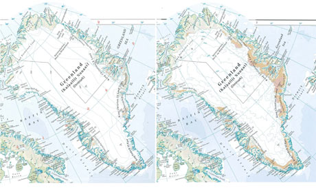
Brown concludes that Times Atlas’ mistakes on the map of Greenland was probably due to ‘either a misunderstanding of geography or an erroneous hypothesis’, which can and evidently do, lead to an misinterpretation of factual data. So while we may have advanced technology at hand that allows us to chart previously inaccessible areas, data that we present to cartographers are like any other data. They do not conclude to anything but what the person/people analysing them conclude. And Times Atlas’ mistake on the mapping of Greenland shows us the most important thing that many nay-sayers of global warming have to realise: while data presented to you are free to any sort of conclusion, a thorough understanding of the Earth’s geological and geographical theories and of the Earth’s physical and chemical processes and its interaction with the Sun is fundamental to gaining a less erroneous conclusion.
With that conclusion, I do encourage you to also read the chapter in Time’s Arrow, Time’s Cycle by Stephen Jay Gould about data collection and analysis (I have forgotten which chapter that is but the use of counting black and white swans is used as an example). It’s more of a philosophical book and it is very boring and dry in general (when I first read it). But it does explain (partly, I suppose) why I say that a thorough understanding of geological and geographical theories will lead to us forming a less erroneous conclusion, instead of a truer/accurate conclusion.
And I also promise that the next entry won't be discussing map methodology but the stability, or rather instability, of the ice sheets that make up Antarctica.