Hello hello and welcome to my wannabe academic blog. I'll try my best to shed some light and provide intelligent discussions on the changes of ice cover on the poles through time (and the significance of this) over the next 10 weeks. I will be dabbling into the cultural and ecological consequences of the changing volumes and surface areas of ice sheets at some point as well, so it's not all that science-y and oh my gosh the world is going to be like the movie 2012.
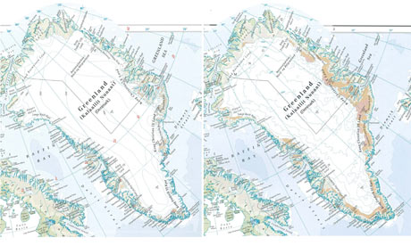
Just so that I won’t scare people off with some stuffy and utterly dry journal, for the first entry (whoop whoop) I’m going to talk about something rather light-hearted. By that, I mean we can just have a good laugh, shake our heads and tsk away at someone else’s mistake, which is my favourite past time by the way. In this case, the head-shaking is done at the expense of HarperCollins for their very, very mis-leading 13th edition of the Times Comprehensive Atlas of the World, published some time in mid-September. The mistake isn’t that they forgot that Sudan is now split into two countries, though I can’t vouch for that having not yet read this atlas. Rather, they have decided to make the effects of global warming a little more visible i.e. colouring in more brown and less white.
Despite strong objections and outright rejection of the Times Atlas declaration that 15% of Greenland’s permanent ice cover that been lost over the last 12 years by glaciologists all over the world, Times Atlas have insisted that their analysis of the data from the US Snow and Ice Data Centre (NSIDC) is accurate and ‘categorical’. My interpretation of that is that Times Atlas had used a different set of definitions to analyse the data from NSIDC thus leading to a different conclusion from that drawn from the science community. This then brings me to my introduction into the measuring of changes in extent of ice cover. When measuring the extent of ice cover, the thickness of the ice sheet along with surface area covered by ice sheets must be taken into account. These are two separate factors that can lead us to a better understanding of the pattern of changes in the ice cover. Times Atlas had, for some reason, decided to use ice thickness to determine the surface area covered by the ice sheet, which led them to the wrong conclusion.
Whether or not they were using this 15% of ice cover loss as an advertisement for the book as suggested by Jeffery Kargel, the decreasing volume of ice is very real. Despite the uncertainties in measurement of ice cover, it is generally agreed that ice volume is reducing about 0.1% per year or about 200 cubic km per year. And of course, that means that sea level is rising and low-lying islands like Mauritius are at risk of drowning and various other problems.
While these two articles by The Guardian allow us to peek into the ‘physical science’, it also hints subtly at the power of media to influence perceptions on issues like global warming.
And now that I’m tired and have gone over 500 words, I’m going to stop. The links to the two articles are below.
And

1 comment:
Good to see you launching straight into a topical issue. You should also have a look at this post on Realclimate.org
http://www.realclimate.org/index.php/archives/2011/10/speculative-polar-cartography/
finally would be good to see you name and picture near the top of the blog too!
Post a Comment